
Adobe Indesign
Aktiv Grotesk.
Type Specimen
ideation
The goal was to present the most characteristic features of Aktiv Grotesk typeface in its specimen layout. Design communicates both denoted and connoted messages. The piece has an inviting layout. It grabs target audience’s attention. The messages used are clear. Layout contains a visible path and is cohesive with subject’s characteristics.


spread prototypes
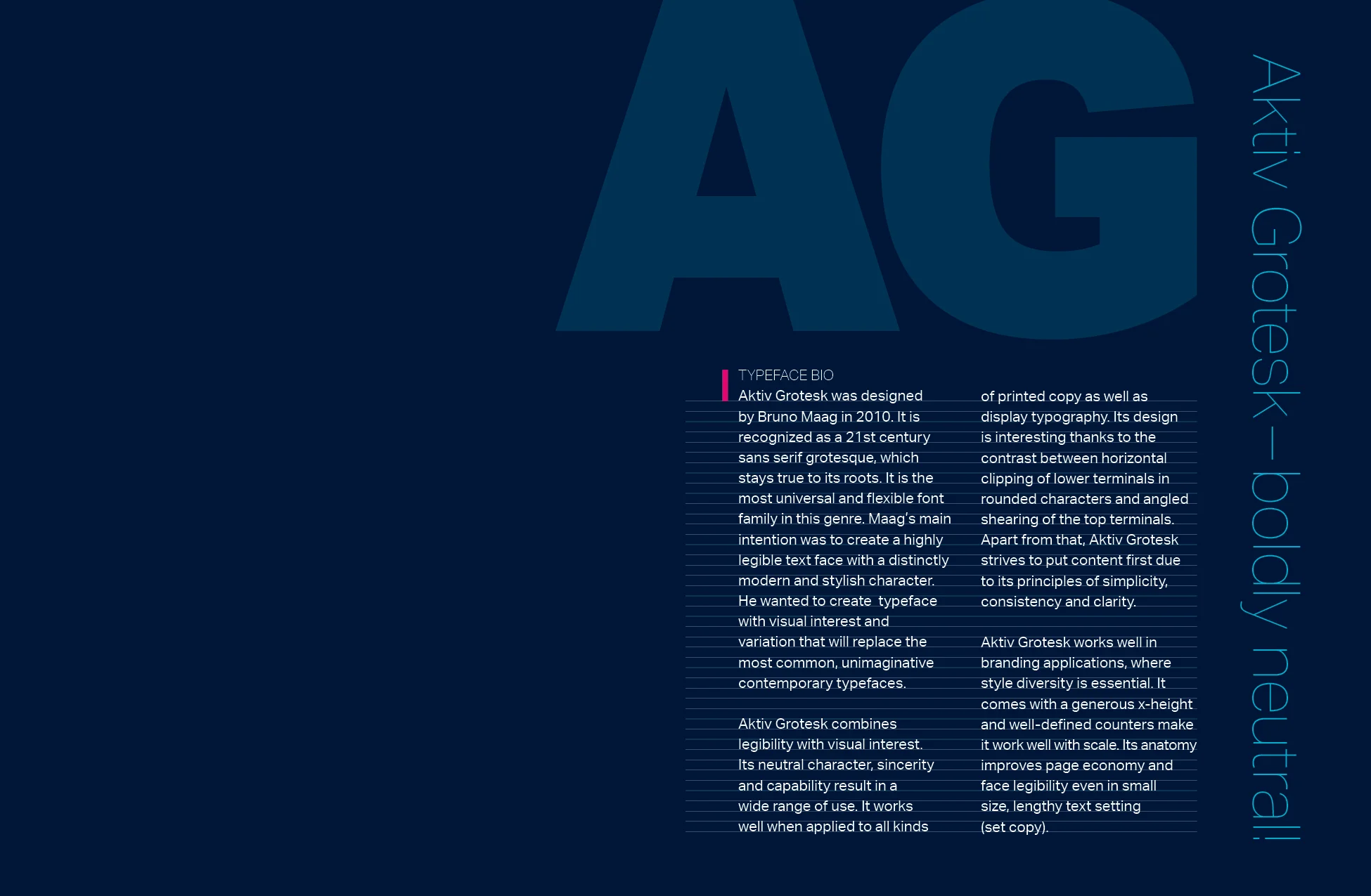
The specimen conveys Aktiv Grotesk’s bio and its voice. There is also an explanation of what were the reasons and inspirations for Bruno Maag to create this typeface. All Open Type features are listed and several of them are depicted in illustrations. Aktiv Grotesk’s diversity is presented in tables across three spreads. In addition, all supported languages are meticulously listed out across two pages. Foundry and designer information are included as well.
Right-hand pages have a dark blue background throughout the entire booklet. Majority of left-hand pages have a white background. Body copy is set on the “outlined” baseline grid. This creates an interesting and rhythmic feel of the layout, which compliments Aktiv Grotesk’s nature. The overall composition varies throughout the booklet. Several pages contain large blocks of text and others are filled with illustrations.


aktiv grotesk type specimen mockup